I started my career as a visual designer at an agency before moving into in-house product design, where I've focused on building consumer products at different scales, from 0→1 products to experiences used by millions of people. I'm most motivated when I hear from users that something I helped create is genuinely meaningful to them.
I find inspiration beyond the screen, too. I travel, cook, make coffee, and love exploring all the beautiful things happening in the world around me.
Product Designer @WhatsApp (Meta)2025–2026
Senior Product Designer @LegalZoom2023–2025
Product Designer @Evernote2021–2023
Visual Designer @Fjord2018–2021
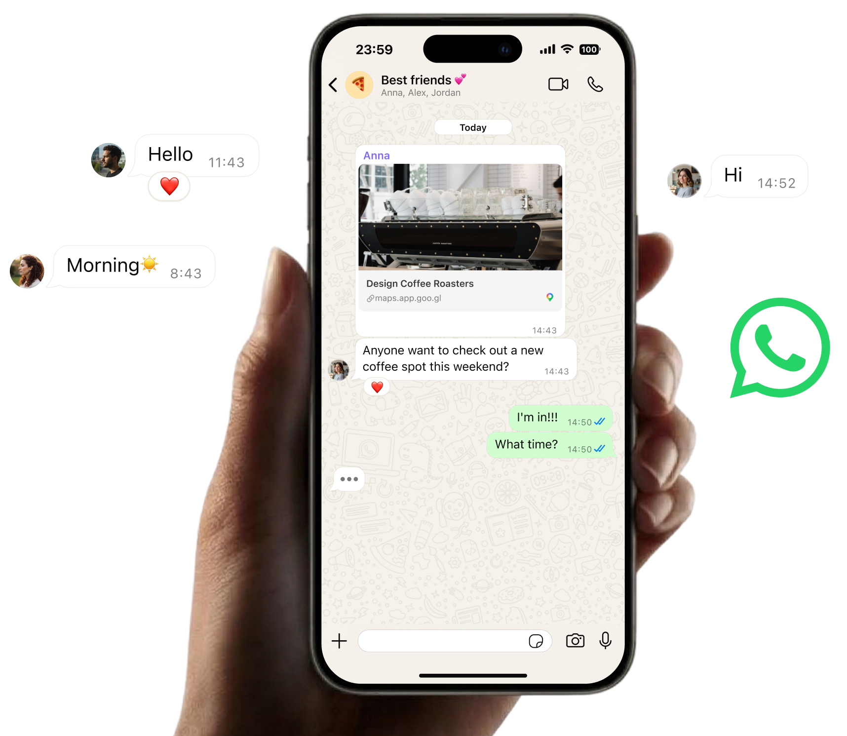
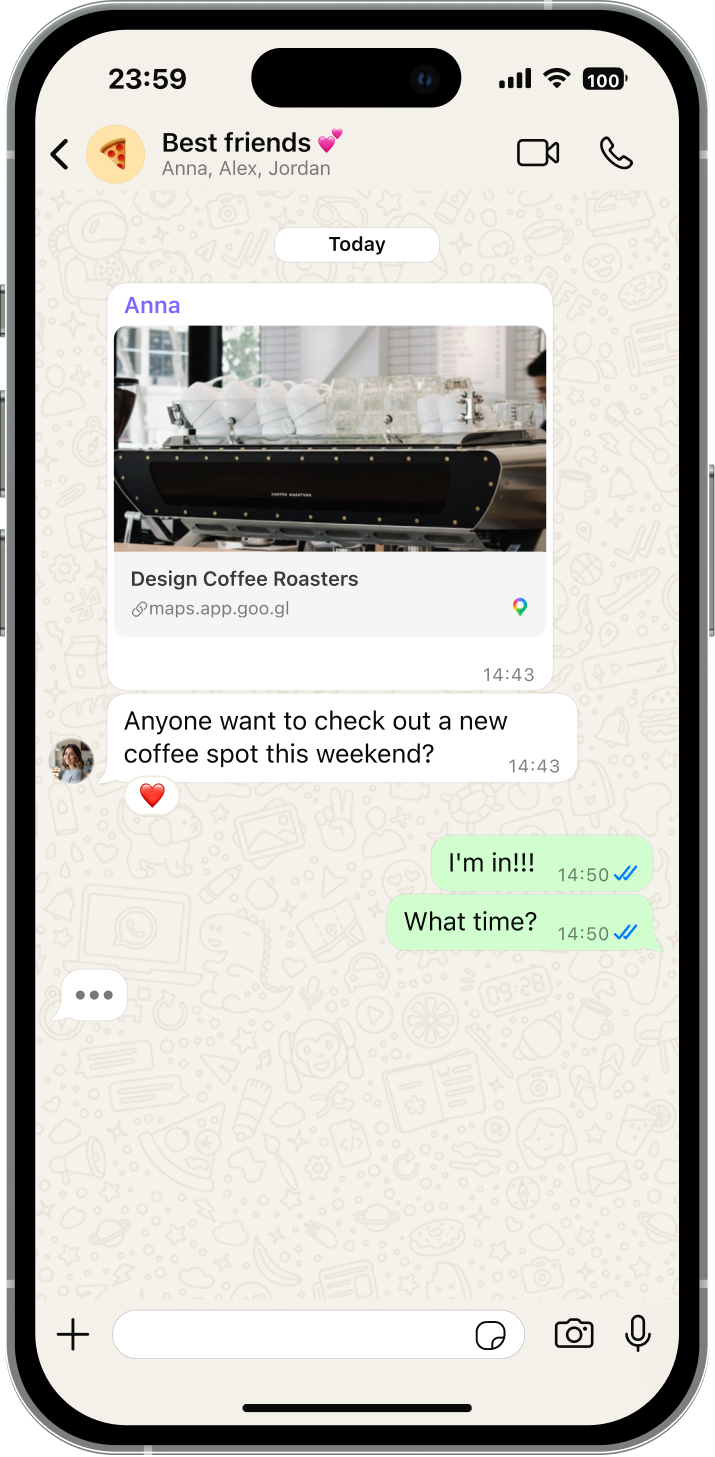
WhatsApp core messaging experience
Designed and shipped core messaging experiences for 3B+ users worldwide
Impact
+XXK Daily Group Creations
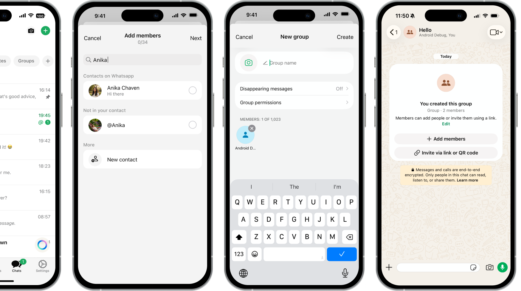
Streamlined creation journeys and resolved key drop-off points, driving a +X% boost in completion success rate at global scale.
+0.X% Lift in Daily Active Users (DAU)
Scaled cohesive design improvements across all key focus areas, driving measurable daily active engagement at global scale.
+XXK Daily Notification Opt-ins
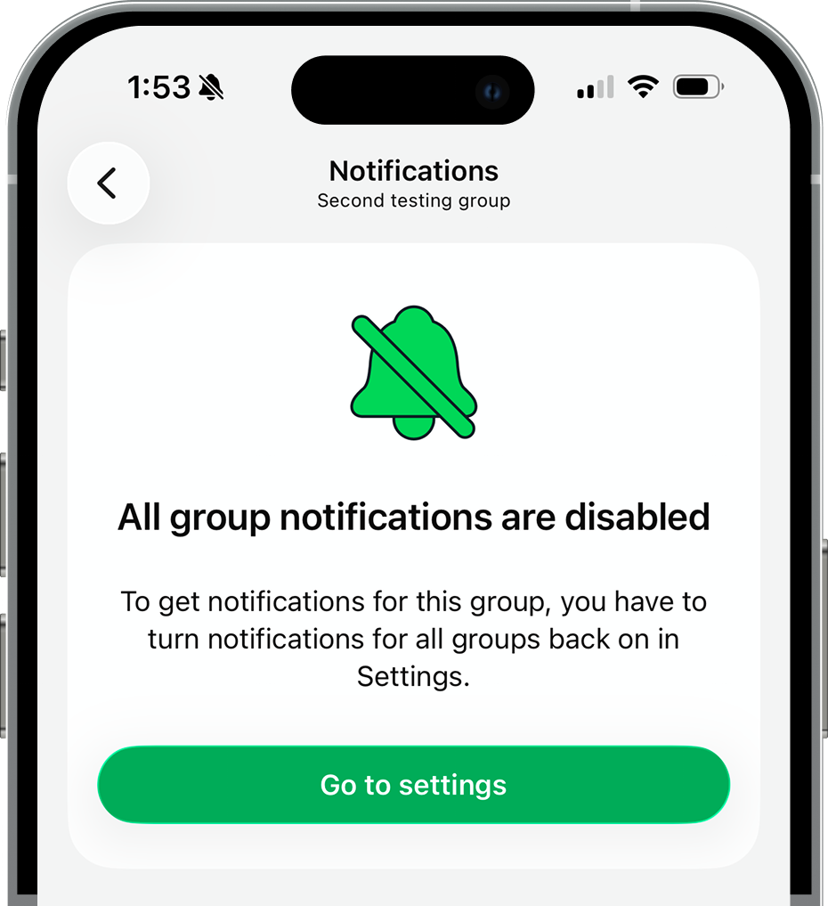
Uncovered re-engagement opportunities for unnotified chats, helping more users enable notifications and stay connected to key conversations.
*Data and specific metric values have been sanitized or relative-indexed for NDA compliance.
Key Focus areas
Notifications & Re-engagement
Led design and experimentation in an ambiguous product area that had never been systematically owned by a single team, bringing the team together to uncover opportunities, drive engagement, and shape product direction.
Messaging Experience
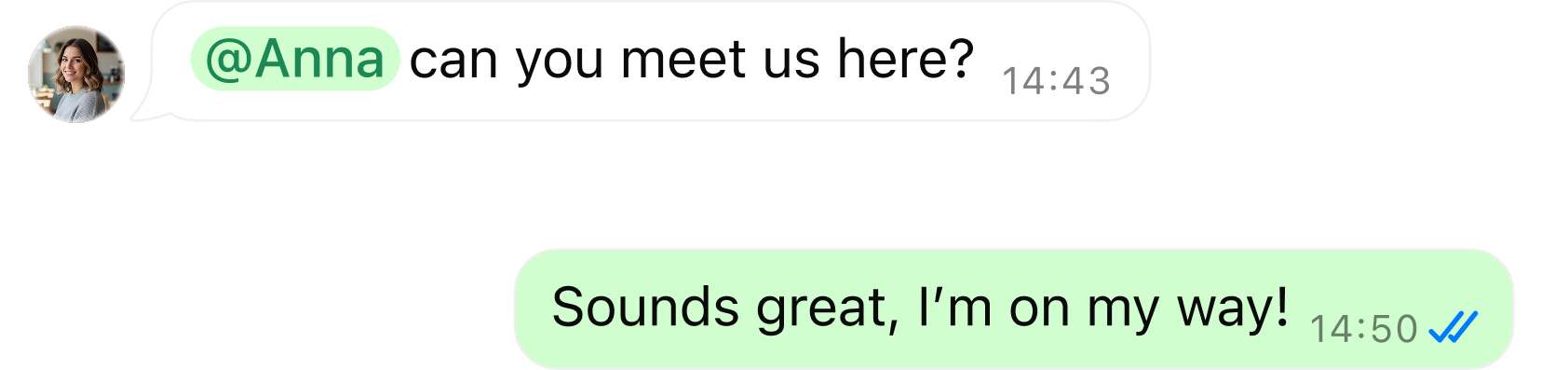
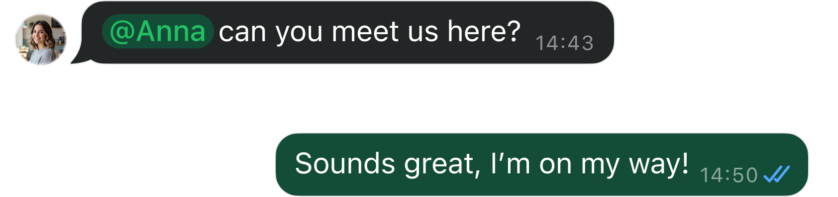
Elevated core messaging interactions across link previews, the composer, and @mentions, improving how people compose, share, and interact in conversations.
Group Creation & Conversation
Focused on group creation and forwarding journeys, uncovering friction that limited completion and identifying opportunities to increase engagement across key entry points.
My role
I shaped product strategy and design from opportunity to launch, partnering closely with cross-functional teams to turn complex problems into thoughtful experiences.
Shaped the opportunity
Identified gaps and opportunities within my product area through product audits, research synthesis, and cross-functional insights, translating findings into initiatives that supported product and business goals.
Used AI to move faster
Integrated AI into my design workflow to synthesize past research, rapidly prototype functional experiences, and test concepts in high-fidelity sandboxes, helping me explore more ideas and learn faster.
Brought teams together
Partnered with PM, Engineering, Research, and Data Science to move ideas forward, leading workshops and working sessions to generate ideas, align teams, and drive decisions.
Designed for quality and scale
Considered how experiences fit into broader product ecosystems, building patterns that extend across surfaces and use cases. Stayed involved through implementation, testing, and bug bashes to ensure a high bar for craft and quality.
Want to know more? I'm happy to dive deeper. Get in touch
LegalZoom Tax: Expert messaging
Designing a connected support experience for customers and tax experts.
My role
I joined the team when LegalZoom decided to build its own messaging tool from the ground up. As the sole designer, I led the end-to-end design of the new experience, from concept and research through testing and launch.
My role was to figure out how messaging could integrate into existing customer and expert workflows, while establishing a scalable foundation that could eventually extend across other LegalZoom services.
Impact
+75 NPS points
Improved customer satisfaction with the tax expert experience.
4× Faster Response
Reduced average response time from 2 days to 0.5 days through a more efficient workflow.
Scalable foundation
The messaging and collaboration patterns became reusable components in the global design library and were later incorporated into other legal workflows.
Problem: Customers couldn't get continuous support
LZ Tax is an online service that helps small business owners file their taxes with expert guidance throughout the process. Tax experts support customers along the way, from answering questions to reviewing their returns before filing.
Previously, customers and tax experts relied on email to communicate. Customers couldn't directly reach the expert working on their case, they had to email a general support address, while replies came from a no-reply email.
This fragmented experience made it difficult to maintain context and continuity, often leaving customers feeling like they had to repeat themselves to get personalized support.
Challenge: Designing a seamless workflow across three roles
To provide a better support experience for customers, I needed to improve more than the customer experience. The service also depended on how tax experts and Operations worked behind the scenes. I started by researching and mapping how communication flowed across all three groups customers, tax experts, and Operations and understanding the needs of each.
Operations — Reduce manual triage
Operations needed a way to automatically route customer questions. Case-related questions could go directly to the expert already working on the case, while general questions could be assigned based on expert availability.
Customers — Build confidence and continuity
Customers wanted to know they were connected with an expert who understood their case. Keeping the conversation connected to the case meant they could receive more continuous, personalized support without repeatedly explaining their situation.
Experts — Reduce the friction of responding
Experts often had to move between different tools to find case information and communicate with customers. We wanted to bring the relevant context and communication together so experts could respond more efficiently.
Solution: One connected experience
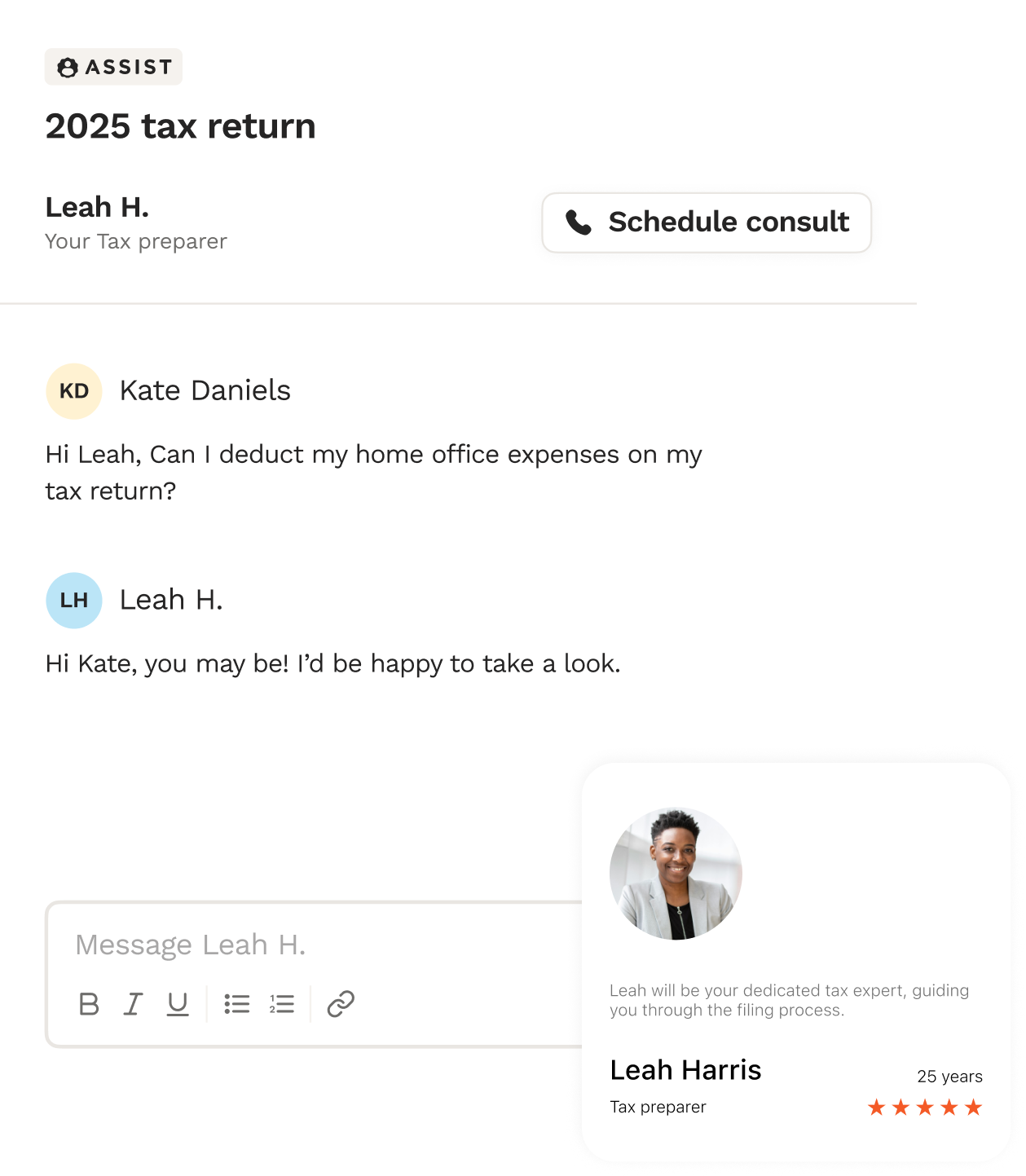
A unified messaging experience integrated into both the customer and expert portals, creating a consistent, seamless way for customers and their tax experts to communicate throughout the filing process.
Operations — Smarter triage
Automatically route case-related questions to the expert already working on the case, while general questions can be assigned based on expert availability.
Customers — Build confidence and continuity
Connect customers with an expert who already understands their case, creating a more continuous and personalized support experience.
Experts — Everything in one place
Bring customer conversations directly into the case workflow, giving experts the context they need to respond without switching between tools.
Evernote task: Natural language due dates
Reducing friction in task management by letting users set due dates as they type.
My role
As the sole designer, I led the end-to-end design of the natural language due-date experience, from the core interaction to the monetization flow, in partnership with Product and Engineering across concept, research, and usability testing.
Context
When it comes to task management, the ability to set a due date is essential. Users rely on due dates to plan their day and get reminders to complete tasks, making it the most-used feature in Evernote Tasks.
Due dates were also closely tied to product engagement. Our data showed that users who set more due dates tended to be more active in Evernote, while reminders gave users a reason to return and stay engaged.
Given the importance of due dates, we introduced advanced due date capabilities as a paid feature, creating more value for subscribers while turning a high-intent workflow into an opportunity to convert free users to paid plans.
Problem: Too many clicks to set a due date
Since due dates are such an important part of task management, even small amounts of friction can make the experience feel cumbersome.
In fact, one of the top reasons users stopped using Evernote Tasks was that setting a due date took too many clicks.
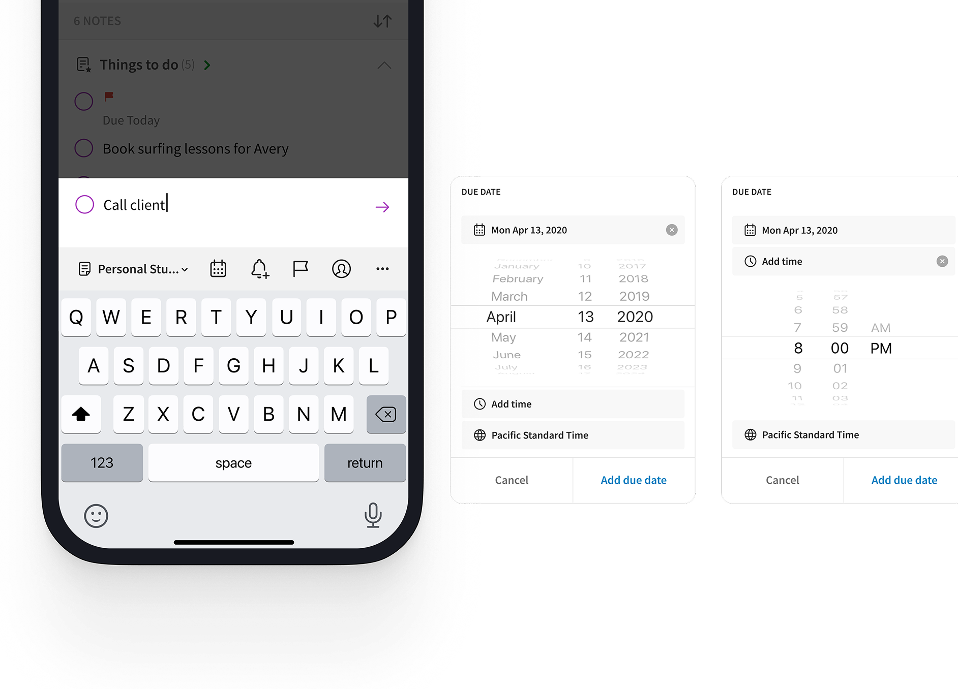
Users wanted to capture tasks as quickly as possible. While the existing flow took five clicks or fewer, it still felt like too much effort for a simple action.
Explorations
Explored different visual treatments and interaction patterns, using user testing to validate and refine the final direction.
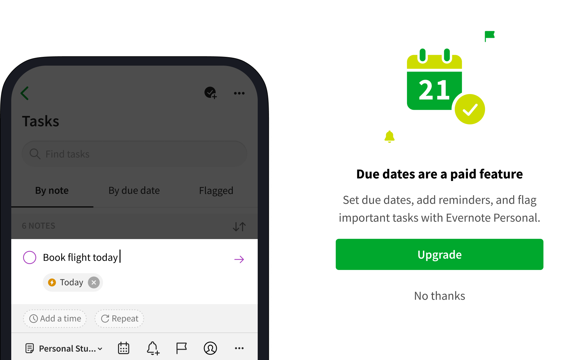
Solution: Set due dates as you type
No clicks needed
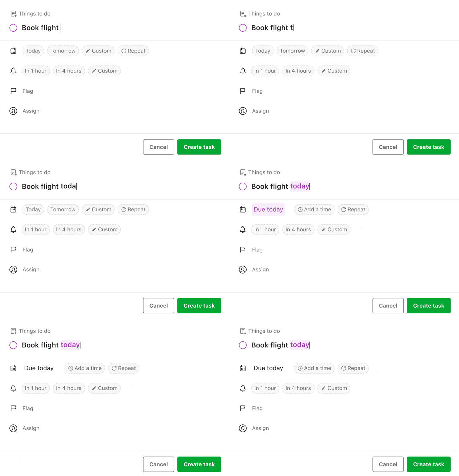
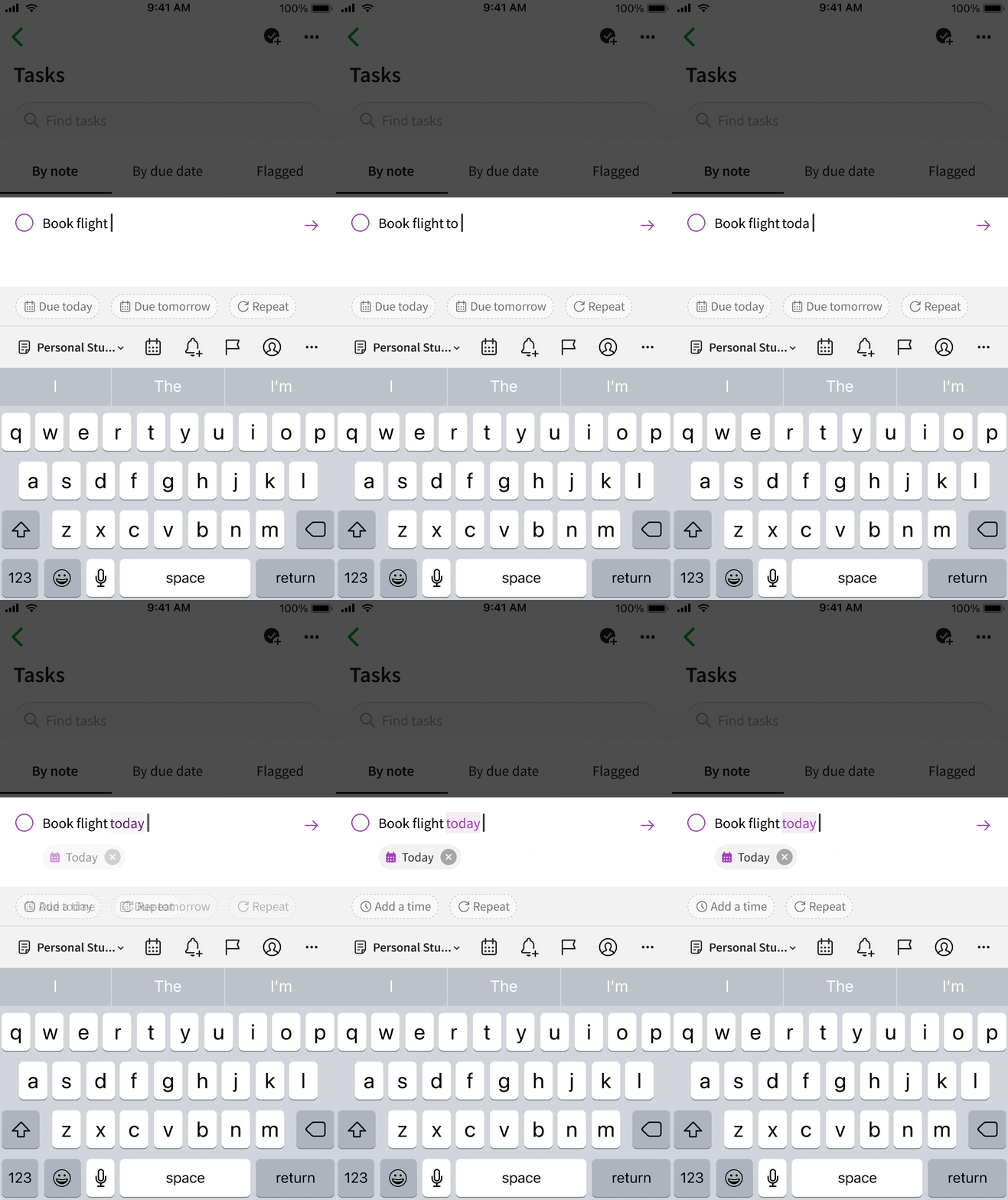
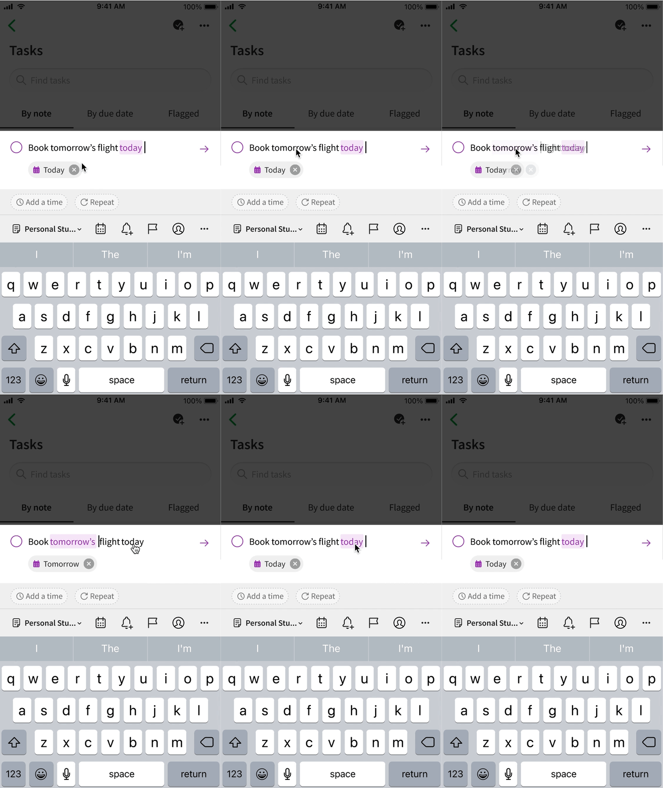
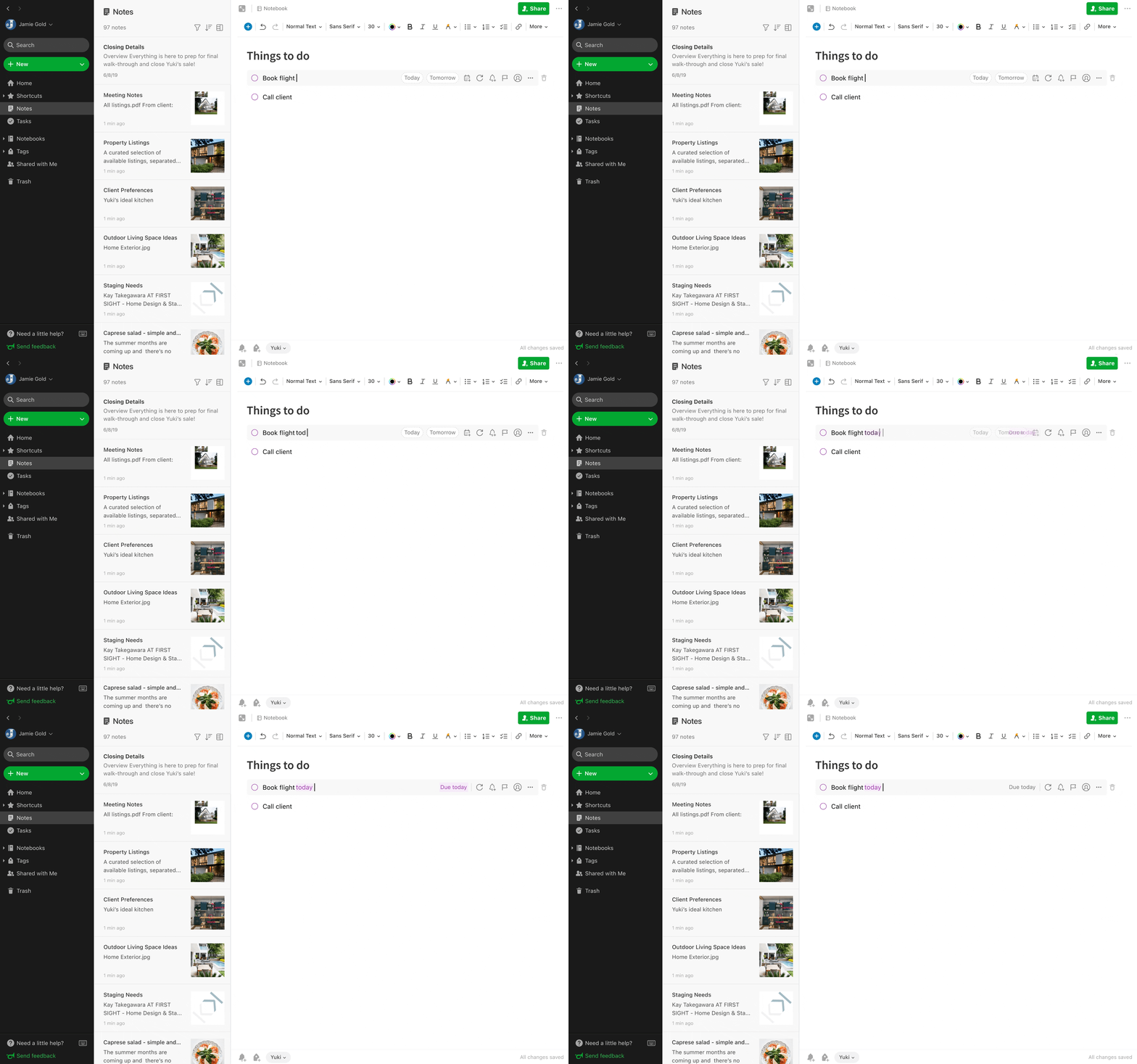
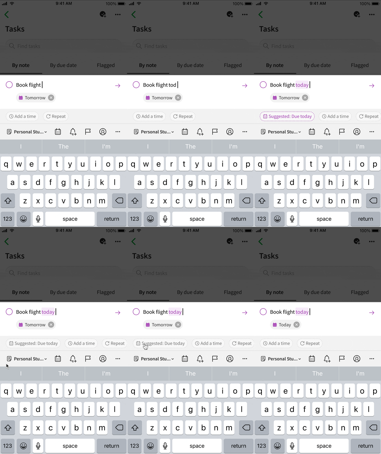
Users can simply type a date into the task title using their keyboard, without interrupting their flow.
Seamless across devices
Smart Due Date was accessible from both the note and task modal, creating a consistent experience across mobile and desktop.
Understand how people naturally write dates
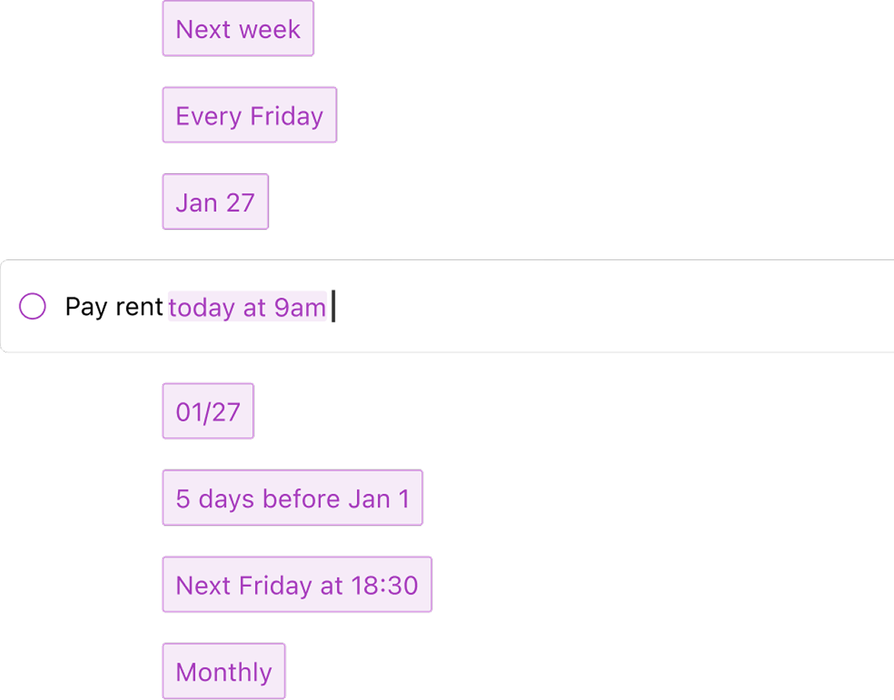
The system recognized 35+ common ways of writing dates, allowing users to express due dates naturally without learning a specific format.
Designing for Subscription
Natural language due dates were introduced as a paid feature, creating additional subscription value and a new monetization opportunity. I designed the paywall to appear when free users intentionally typed a due date, targeting users most likely to see value without interrupting those who didn't need the feature.
Impact
Reduced user clicks, improving overall task completion time.
Laid the foundation for adding more natural language processing features.
LZ Books: New native app experience
Bringing LegalZoom’s financial tools to life in a native app.
My role
I was LegalZoom’s first designer dedicated to building a native app experience, as the company had historically been web-first. I led the LZ Books app from concept to launch, conducted post-launch user research, established the foundation for the native app experience, and partnered closely with Product, Engineering, and cross-functional teams throughout.
Impact
34%
of existing web users adopted the app within ~2 months of launch.
3.9× increase
in users reviewing transactions via mobile.
Context
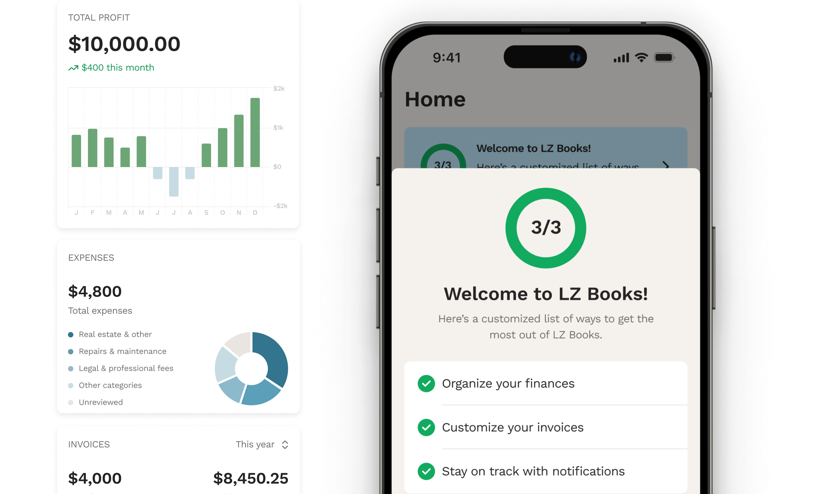
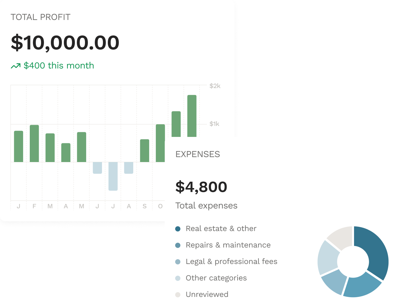
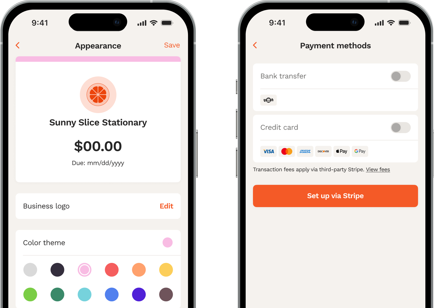
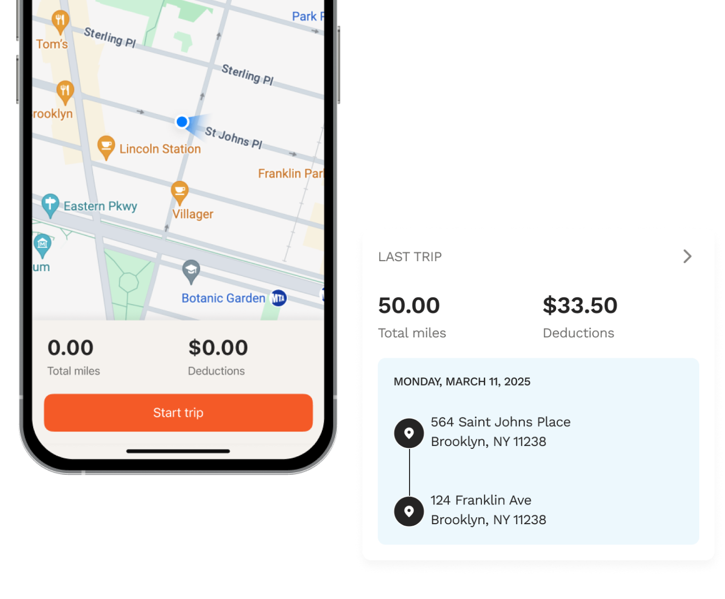
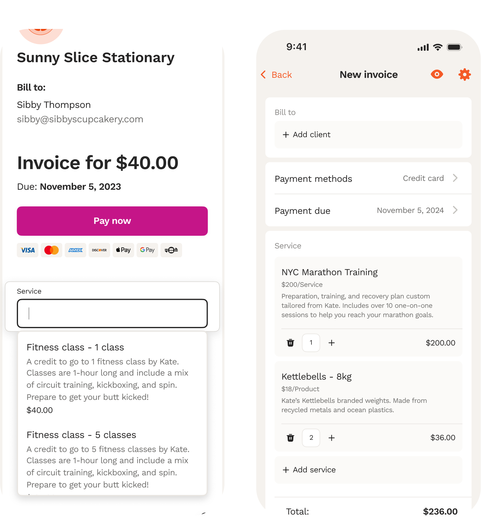
LZ Books is a financial management tool for small business owners. It helps them manage everyday finances, from tracking transactions and discovering deductions to creating and sending invoices.
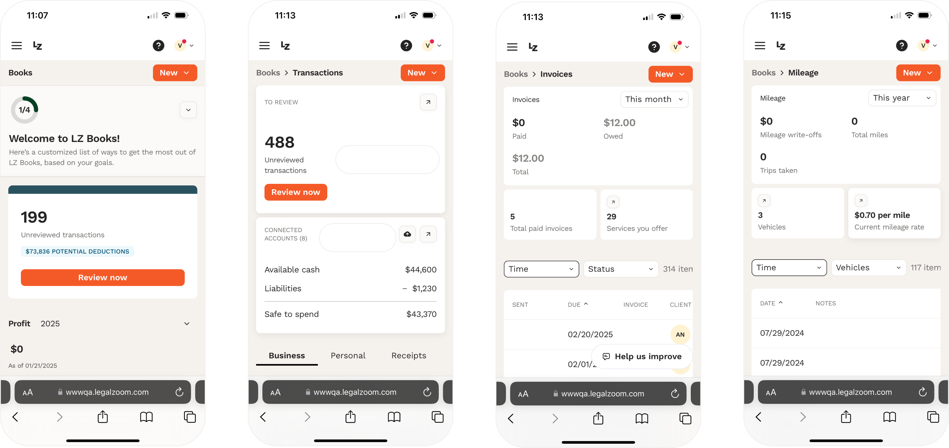
At the time, LZ Books was only available on the web, while users were increasingly accessing the product from their phones.
Problem: Web-only limited financial management on the go
Research showed that users relied on the web for deeper tasks, like reviewing their business and analyzing financial insights. But quick, everyday tasks were much harder to accomplish away from a computer.
Something as simple as checking a transaction or sending an invoice required users to open a browser, navigate to LZ Books, and log in before they could get started.
25% of users were already accessing LZ Books through mobile web, signaling an opportunity to make these everyday financial tasks faster and more accessible on mobile.
Challenge
Prioritize what belongs on mobile
With a limited timeline, we couldn't simply bring every web feature into the app. I worked closely with PM and Engineering to define the roadmap, using product data and user research to identify which workflows would deliver the most value on mobile. The goal was to balance user needs, business priorities, and technical feasibility while focusing on experiences where mobile could provide a meaningful advantage.
Establishing the foundation for a scalable design system
As we introduced new mobile experiences, I also needed to establish a scalable design system alongside the product. Rather than designing each feature in isolation, I looked for reusable patterns and components that could support future workflows. This meant considering how patterns would scale across different use cases, defining component behaviors and states, and creating a foundation the team could continue building on after launch.
Solution: A mobile-first experience for everyday finances
Leverage native capabilities to make everyday financial tasks more seamless
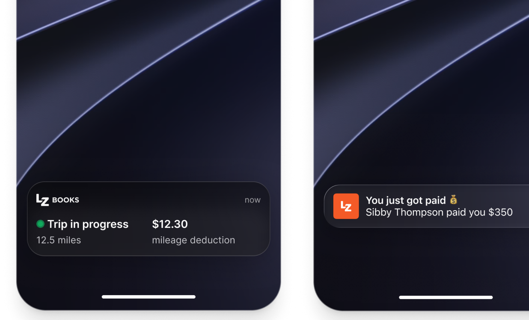
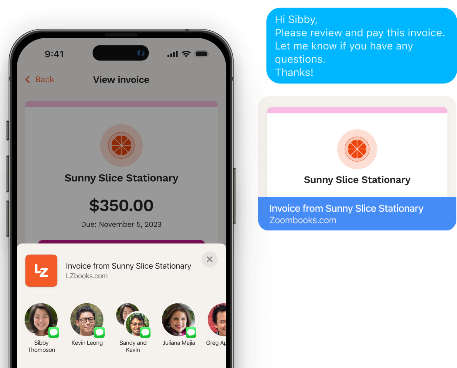
From a Live Activity that keeps mileage tracking visible to native sharing options that let users send invoices beyond email, mobile unlocked faster, more seamless ways to get things done.
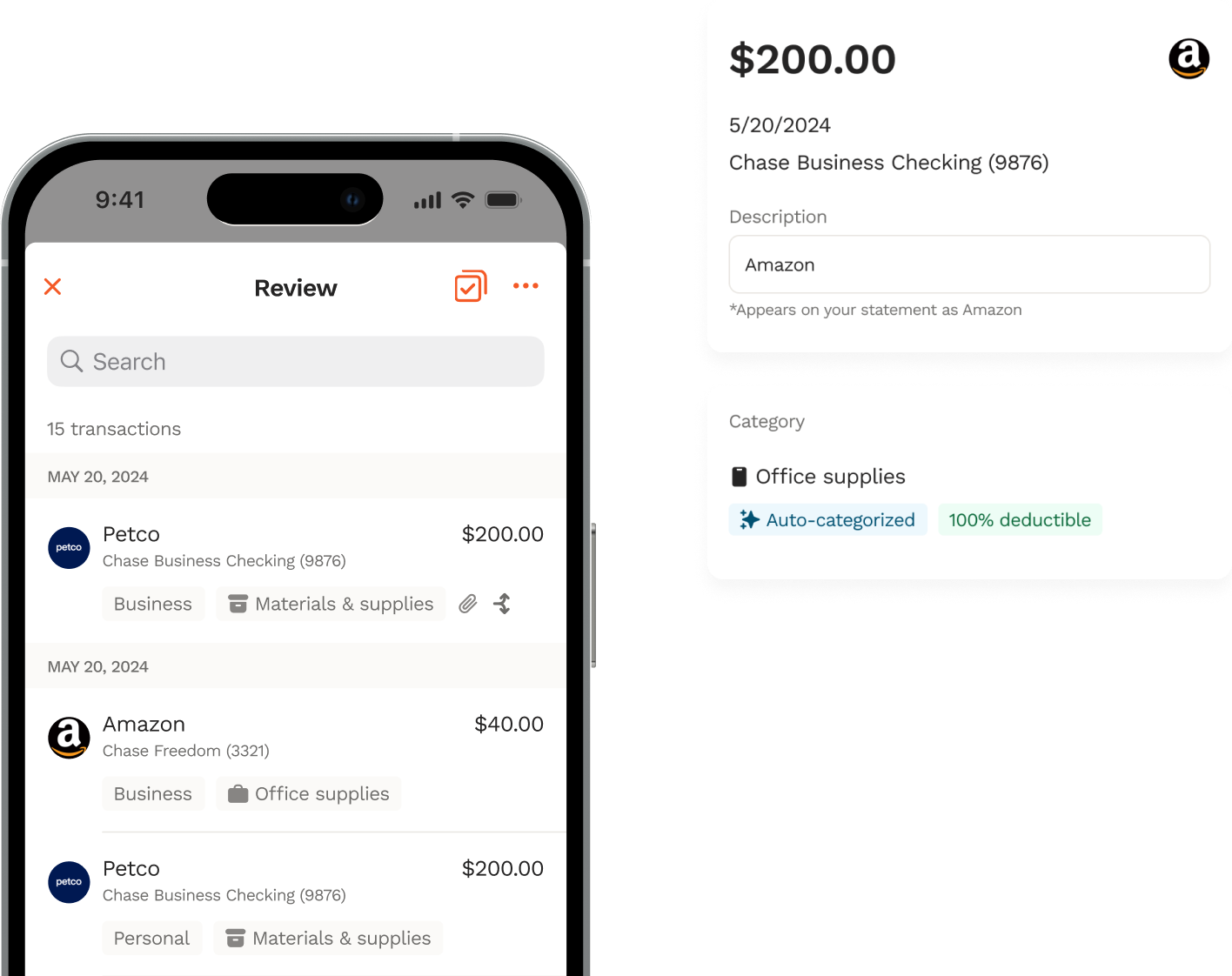
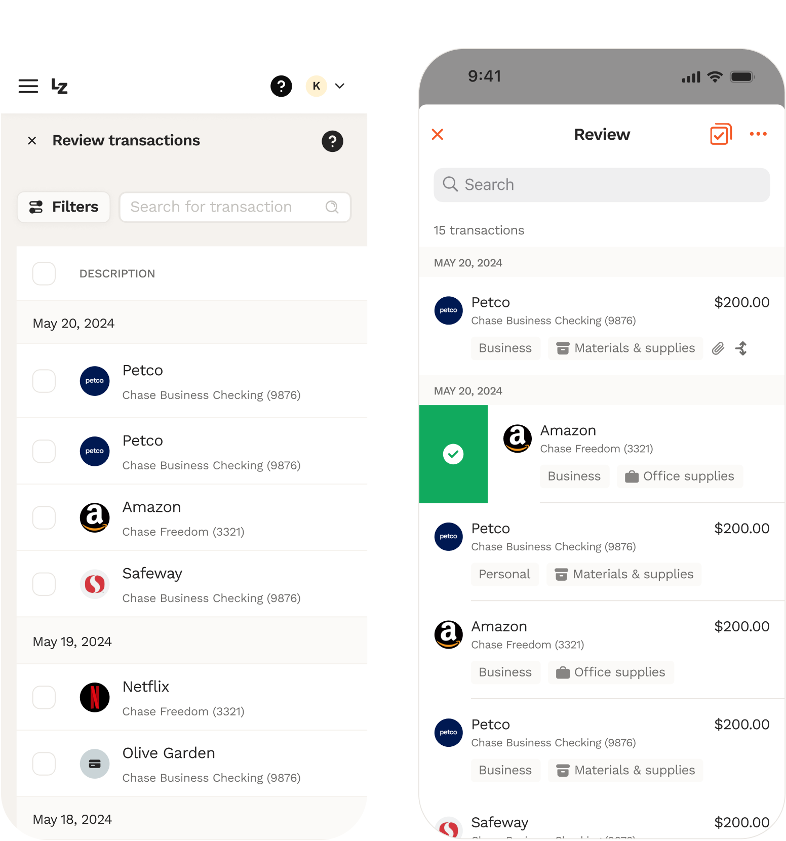
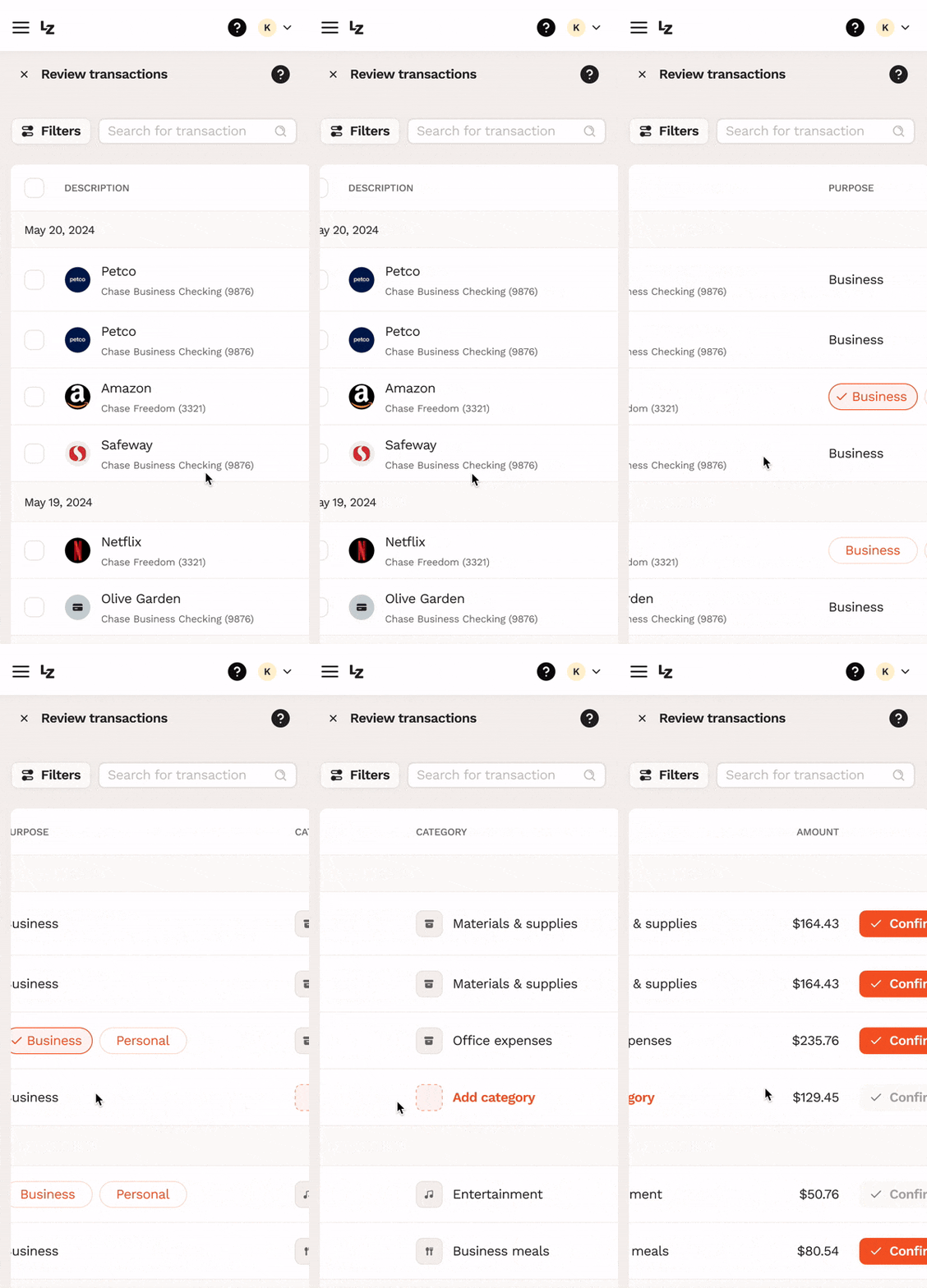
Adapt familiar mobile interaction patterns instead of directly transferring the web experience to mobile
I rethought workflows around the constraints and behaviors of a smaller screen—for example, replacing long horizontal tables with more natural mobile interactions, and using gestures like swipe to make reviewing transactions faster.